Deadspace
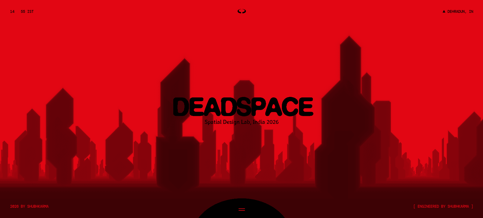
Custom web app using Next.js, Node.js, HTML, CSS and JavaScript.
Case Study · Web · 2025 · Built by ShubhKarma Tech, Dehradun
Client & location
- Live website: deadspace.shubhkarmatech.com/
The problem
Deadspace came to ShubhKarma Tech with a clear business goal but a fragile digital foundation. As a Web brand operating from India, they needed a website that could earn trust, convert enquiries, and stay maintainable after launch. The core problem: Deadspace needed a modern, conversion-focused web presence that could showcase the brand clearly on mobile and desktop while remaining fast to load and easy to update. In practical terms, the business faced a gap between brand ambition and digital execution: visitors could not quickly understand offerings, trust signals, or next steps — especially on mobile. Digging deeper, we found: Experimental brand required a bold digital identity without hurting usability. Heavy visuals risked poor LCP and bounce on slower networks. Storytelling sections lacked a coherent user journey.
Issues we found
- Experimental brand required a bold digital identity without hurting usability.
- Heavy visuals risked poor LCP and bounce on slower networks.
- Storytelling sections lacked a coherent user journey.
How we fixed it
We approached Deadspace as a product delivery — not a page redesign. First we mapped user journeys (discover → trust → enquire/book), then rebuilt information architecture, performance budgets, and SEO foundations around those journeys. ShubhKarma Tech designed and engineered a custom website with clear information architecture, performance-conscious media handling, and enquiry-focused CTAs. The stack for Deadspace centers on Next.js, Node.js, HTML. Our Dehradun studio treated this as a product problem, not a theme swap: discovery workshops, UX structure, UI systems, engineering on Next.js, Node.js, HTML, CSS, JavaScript, QA, and launch support aligned to Web goals in India. Concretely we shipped: Crafted a distinctive interactive frontend with controlled motion. Balanced visuals with compression, lazy loading, and critical CSS strategy. Mapped a narrative flow from brand intro to engagement CTA. The result is a system the client can operate: clearer messaging, faster pages, and conversion paths that work on mobile.
Fixes shipped
- Crafted a distinctive interactive frontend with controlled motion.
- Balanced visuals with compression, lazy loading, and critical CSS strategy.
- Mapped a narrative flow from brand intro to engagement CTA.
Project narrative
Context
Deadspace needed a production-grade web presence that matched their brand ambition in the Web space. ShubhKarma Tech partnered end-to-end — discovery, UX, engineering, SEO wiring, and launch support.
The issue
Deadspace came to ShubhKarma Tech with a clear business goal but a fragile digital foundation. As a Web brand operating from India, they needed a website that could earn trust, convert enquiries, and stay maintainable after launch. The core problem: Deadspace needed a modern, conversion-focused web presence that could showcase the brand clearly on mobile and desktop while remaining fast to load and easy to update. In practical terms, the business faced a gap between brand ambition and digital execution: visitors could not quickly understand offerings, trust signals, or next steps — especially on mobile. Digging deeper, we found: Experimental brand required a bold digital identity without hurting usability. Heavy visuals risked poor LCP and bounce on slower networks. Storytelling sections lacked a coherent user journey.
How we fixed it
We approached Deadspace as a product delivery — not a page redesign. First we mapped user journeys (discover → trust → enquire/book), then rebuilt information architecture, performance budgets, and SEO foundations around those journeys. ShubhKarma Tech designed and engineered a custom website with clear information architecture, performance-conscious media handling, and enquiry-focused CTAs. The stack for Deadspace centers on Next.js, Node.js, HTML. Our Dehradun studio treated this as a product problem, not a theme swap: discovery workshops, UX structure, UI systems, engineering on Next.js, Node.js, HTML, CSS, JavaScript, QA, and launch support aligned to Web goals in India. Concretely we shipped: Crafted a distinctive interactive frontend with controlled motion. Balanced visuals with compression, lazy loading, and critical CSS strategy. Mapped a narrative flow from brand intro to engagement CTA. The result is a system the client can operate: clearer messaging, faster pages, and conversion paths that work on mobile.
Engineering notes
We prioritized SSR/SSG-friendly content where SEO mattered, optimized media for Core Web Vitals, and kept the codebase structured so future features (booking, ecommerce, CMS, or admin) can plug in without a rewrite.
Business outcome
The site now supports clearer discovery, stronger local/brand signals, and measurable enquiry paths. See the results list below for the concrete wins we tracked with the client.
Solution Stack
- Next.js
- Node.js
- HTML
- CSS
- JavaScript
SEO & performance notes
We structured headings, meta-ready page titles, compressed media, and semantic HTML so the site can support organic discovery. Technical SEO foundations (crawlable content, fast LCP-friendly images, internal links) were included in the build.
Results
- Clear brand storytelling and portfolio presentation
- Mobile-first layouts for visitors researching on phones
- Faster path from homepage to enquiry or booking
- Maintainable codebase for ongoing content updates
- Documented problem/solution narrative for sales and SEO content reuse
- Mobile-first UX validated against real browsing patterns
- Technical SEO baseline: titles, headings, internal links, performance hygiene
- Documented problem → fix narrative for sales and SEO authority
- Internal links from case study to relevant service and location pages
- Mobile-first conversion paths validated before launch